The SSW team were very keen that the new design was informed by the School’s community: students, faculty, and staff.
Getting to know SSW
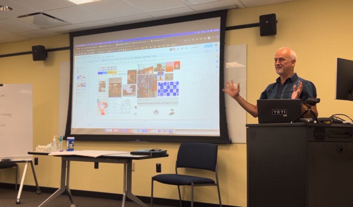
We carried out in depth research including an analytics review, user surveys, stakeholder interviews and workshops, and usability testing.
Working on site at SSW really helped us understand different audience requirements and gave us a feel for the school that would have been more difficult remotely.
We ran multiple workshops, sat in on classes, canvassed students and staff, and ran sessions in SSW’s foyer where we could test initial design and content theories.
Brand interpretation
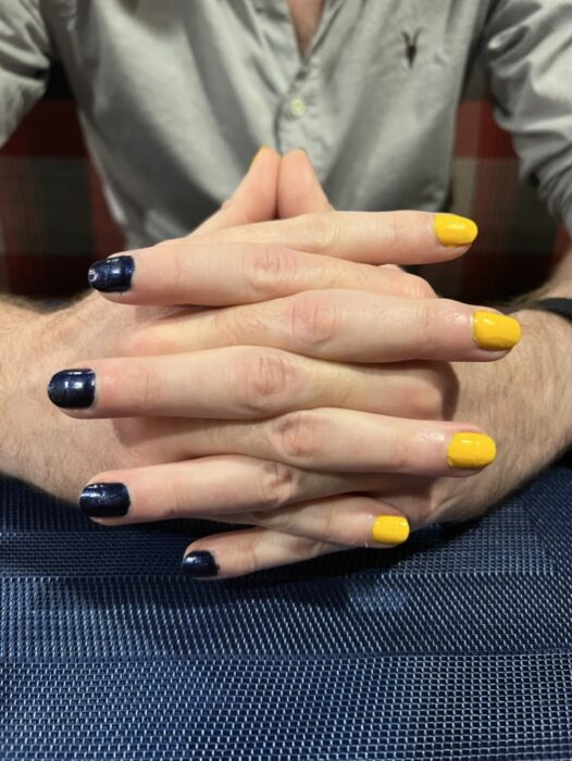
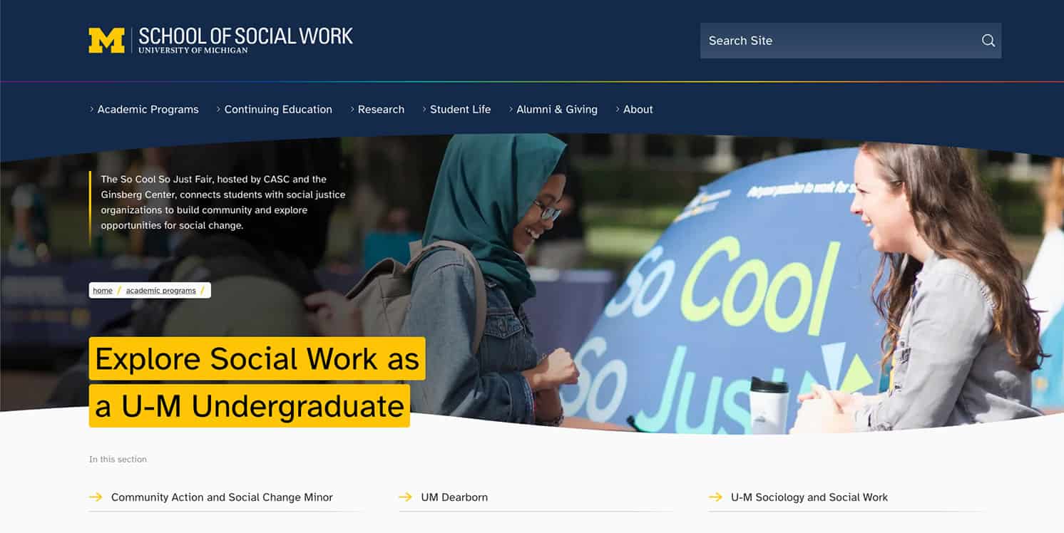
The University of Michigan’s brand is world famous. Most people know the maize and blue, the block ‘M’, and even the “go blue” slogan. It is a brand that portrays strength, prestige, and tradition.
Research showed that qualities such as prestige were important for SSW but only if balanced with attributes more commonly associated with social work, such as care, inclusivity, and being welcoming.
We couldn’t stray too far from the main overarching university brand but we did introduce the following unique elements to help portray SSW’s softer characteristics.
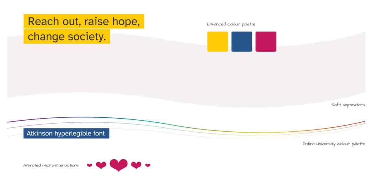
- A curve to frame banner images and separate sections
- A ‘rainbow’ style used as a separator and in the curve
- The addition of a highlight pink to the colour palette
- The use of a super-readable font: Atkinson Hyperlegible
- A beating heart that displays on rollover of SSW’s tag line: Reach out, raise hope, change society
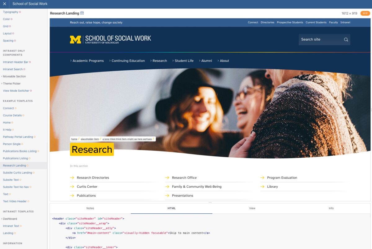
Component library
The work culminated in the development of a component library that provides responsive code for all of the elements that make up the site, as well as full page examples showing how certain elements work together.
The SSW web team used the component library and its supporting documentation to develop the new website and intranet on the Drupal platform.
Headscape were a joy to work with. Friendly, personable, and deeply informed team members approached our website and intranet redesign with wisdom and integrity. Community feedback is very important to us and they took several different approaches (surveys, focus groups, presentations, exercises, and user testing) to get to the heart of our design and information architecture. This has helped us rethink our website and intranet’s structure and visual design with a focus on community, ease of use, and aesthetic appeal. Our time with them has been a breath of fresh air. Not only are we happy with the end result we also loved the process as a whole.
Renée Tambeau, Director of Marketing and Communications
Team
Project Manager

Tech Lead
Designer
Consultant / Founder