The aim for Sense’s new site was for it to be a platform for compelling supporter engagement, and a source of information about Sense’s digital and online services.
Accessibility at its heart
The new Sense website was redesigned and built with accessibility at its heart. Research and testing with visually impaired users before, during, and after the design and build phase, made sure the site was easy to use and worked well with screen readers.
Since the site was launched:
- Organic traffic has increased by 25%
- Donations increased by 33%
- Service enquiries have gone up by 15%
Collaboration
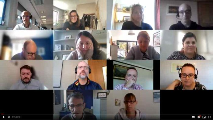
Engagement workshops
We conducted a series of group video calls to understand the types of engagement the website needed to support, who would be engaging, and why. These sessions ensured stakeholders across Sense could be involved in the process, helping to garner support for the project across the organisation.
Visual design
We held design workshops with key people from the Sense Marketing team. We ran through the Sense brand, key brand assets, reviewed inspirational and competitor sites, and showed a set of initial mood-board ideas we had prepared.
Wireframing
We ran wireframing sessions to develop the content, structure, and priorities for different types of page.
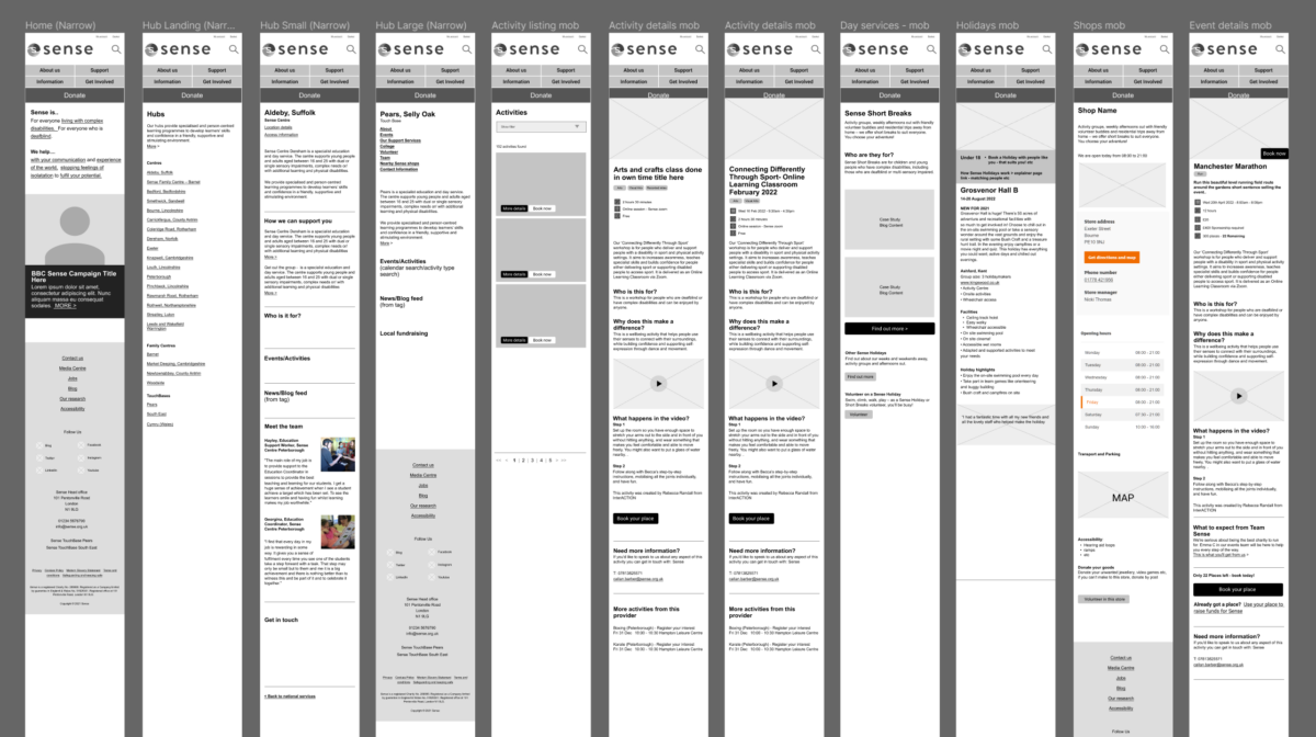
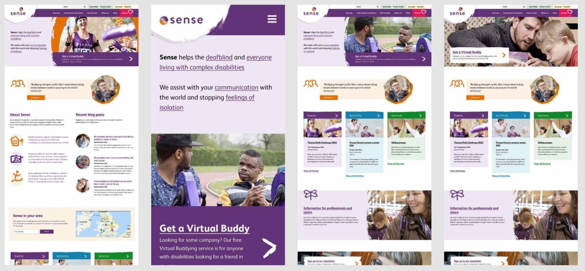
Interactive prototype
Taking the mobile wireframes as a basis, we created an interactive prototype built on WordPress. This prototype was used to flesh out layouts and journeys through the site. It also allowed Sense content editors to start creating content.
Particular emphasis was given to navigation. Flyout menus were used (with a strong focus on keeping them accessible) enabling users to get directly to important content from every page of the site.
This prototype was sufficiently developed to allow task-based user testing.
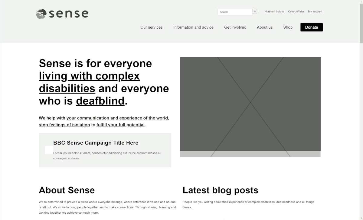
Initial design work
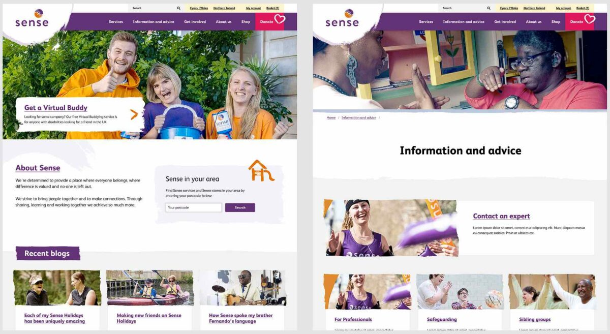
Based on the inputs from the wireframing and design workshops we worked on some initial page ideas. We worked on ensuring a good balance between white space and brand colours, as well as achieving the right balance between Sense’s primary and secondary palette colours (purple and orange).
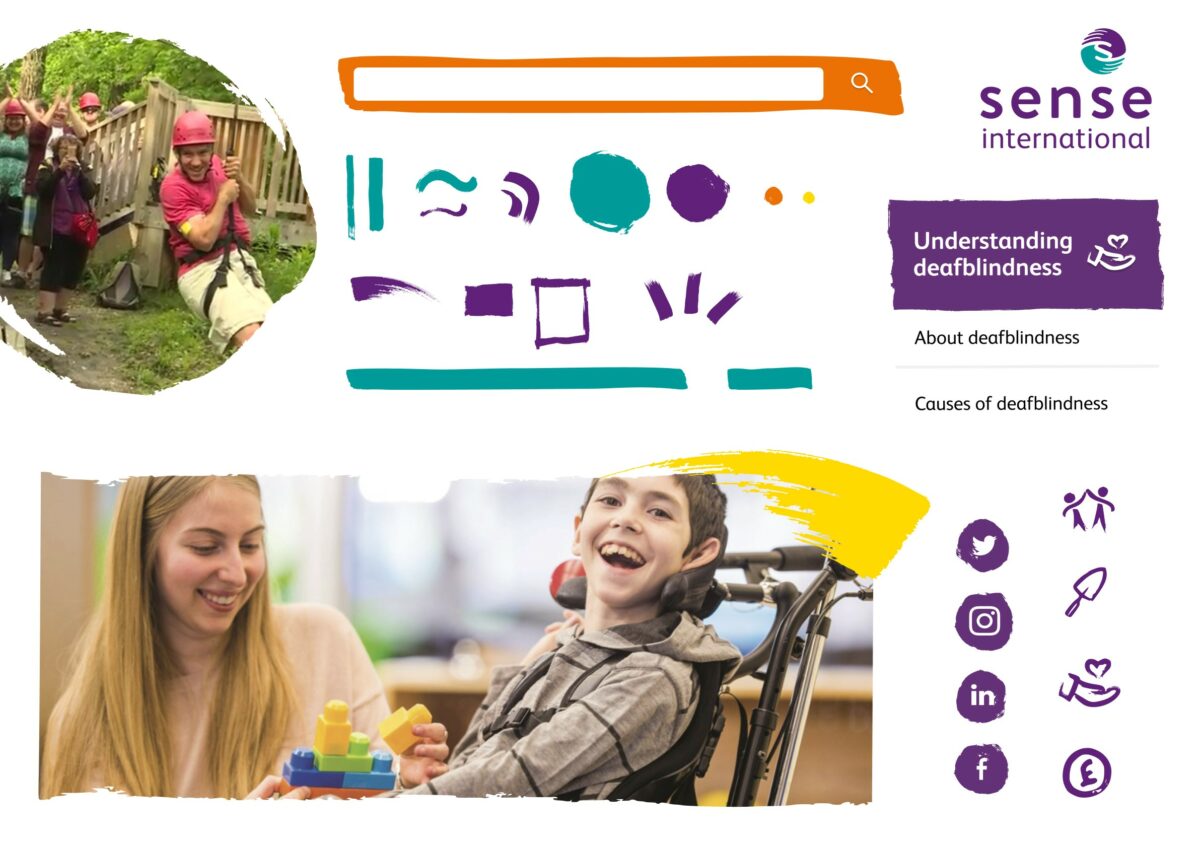
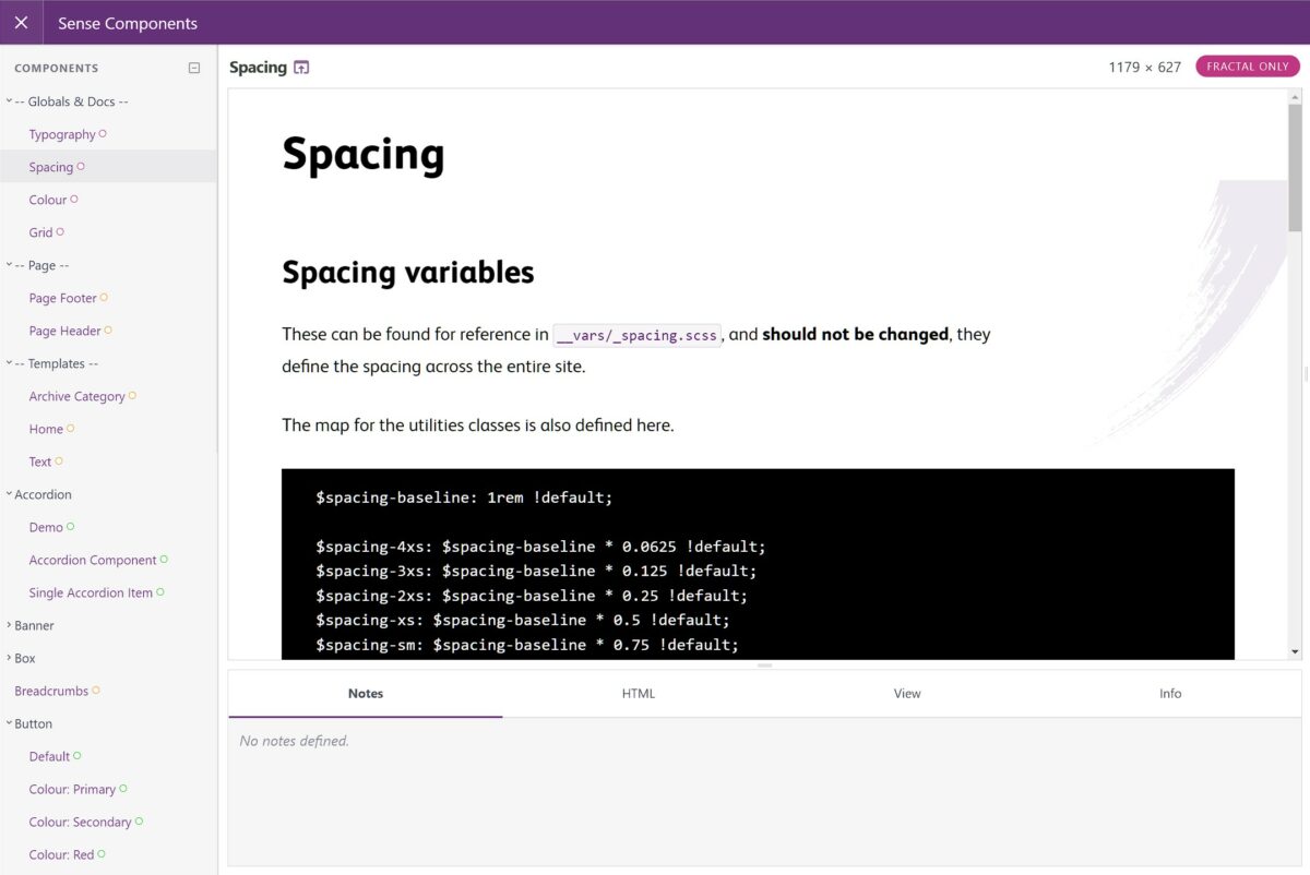
Design system
We built a design system for Sense that provides a library of the components that make up the site and code examples for future developers working with the digital brand.
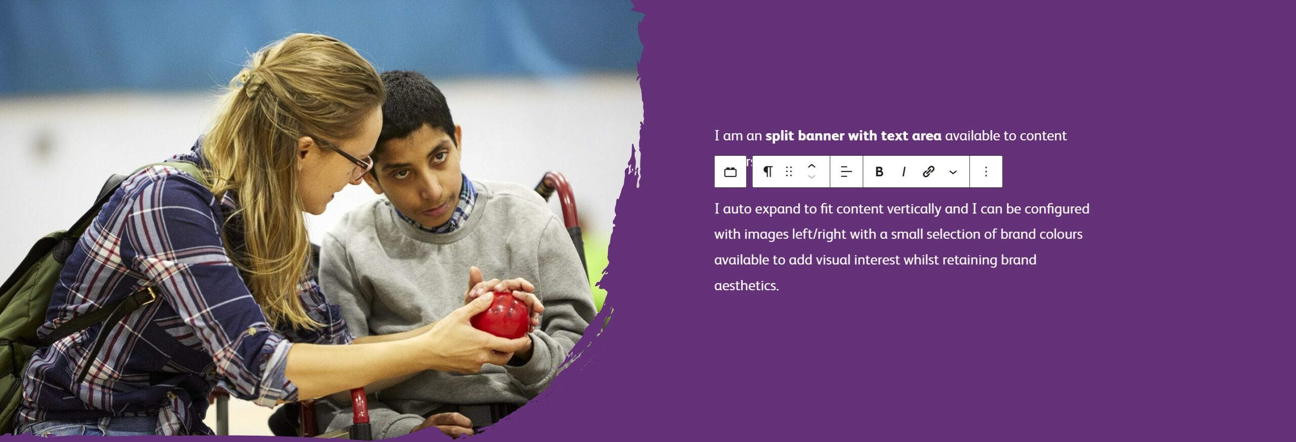
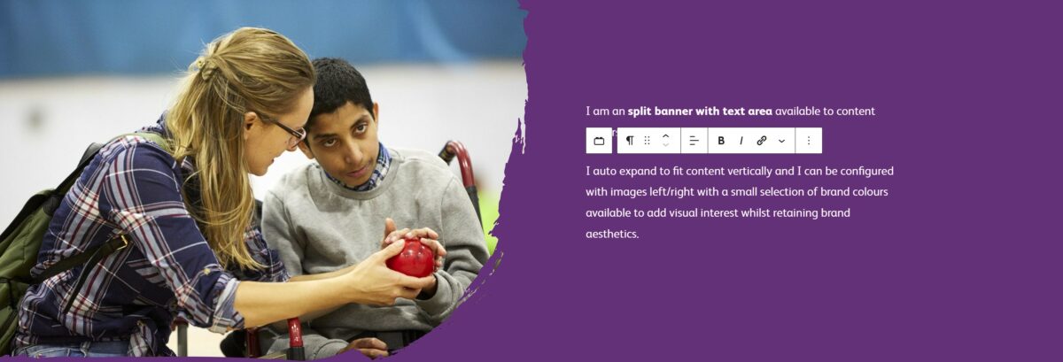
Custom WordPress blocks
A key requirement of Sense’s editors was the ability to have control over page elements enabling the creation of engaging page layouts. To deliver this requirement we developed a set of custom WordPress blocks. These give editors the flexibility they want, but enforce brand discipline.
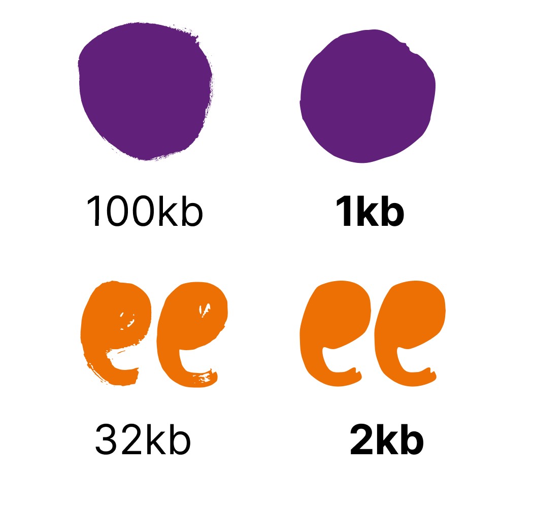
Scalable vector graphics
The nature of the brand, together with the requirement for fast, efficient downloading steered us quickly to working with vector graphic elements. Many of the graphics supplied in PDF and Illustrator formats needed to be simplified to keep file sizes down.
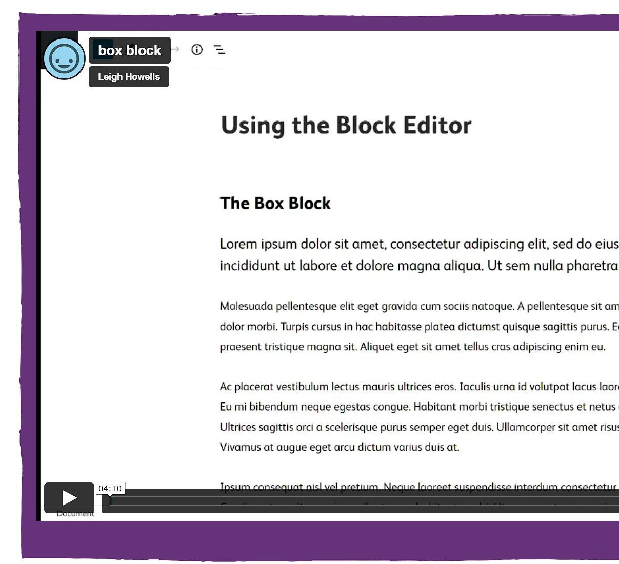
Documentation and help videos
We provided a set of documentation built right into the WordPress editor interface. These include video walkthroughs to help use the block editor, default blocks and the new custom blocks.
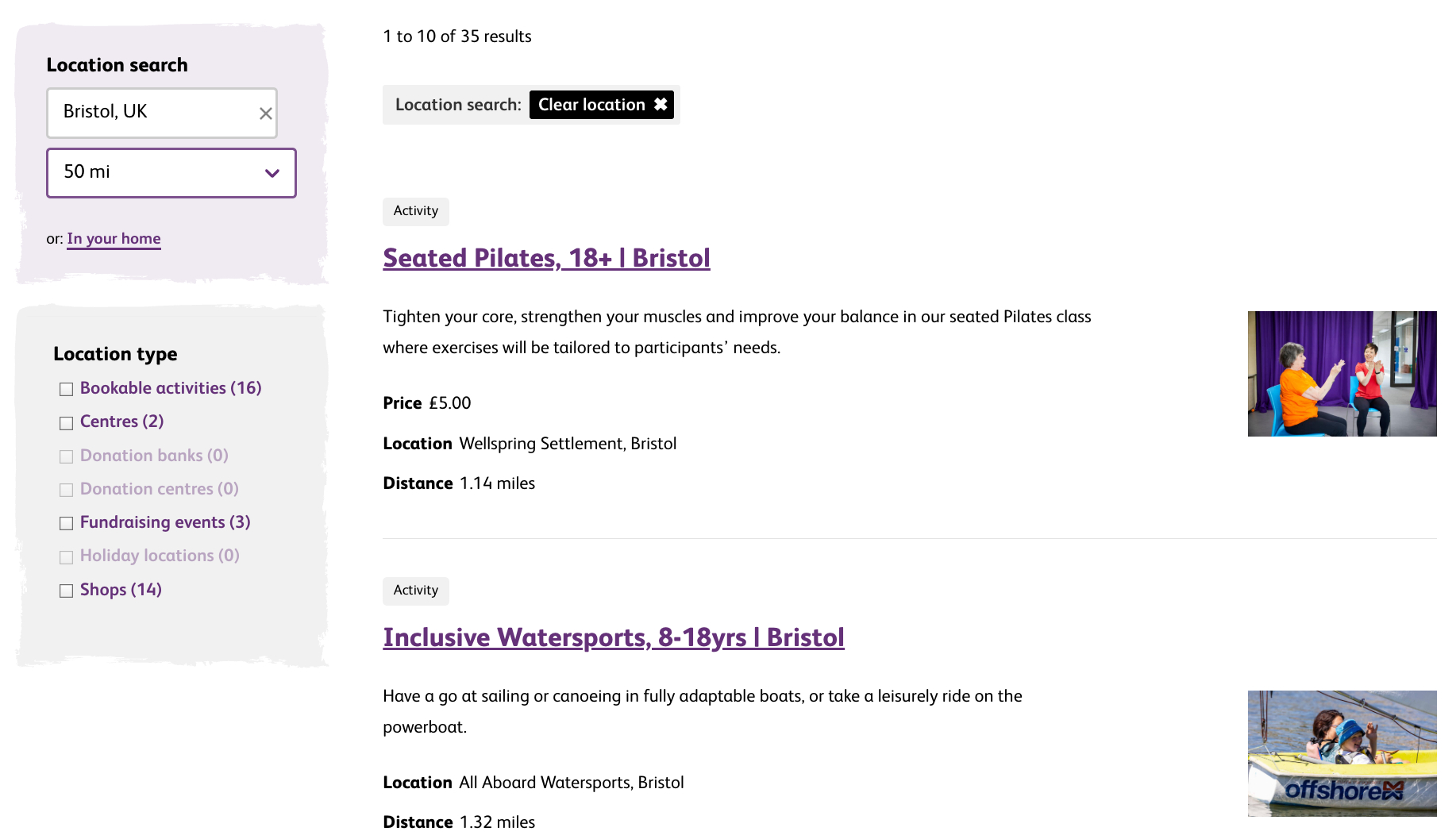
In your area
With its nationwide coverage, Sense wanted to provide an ‘In your area’ search facility enabling users to find all available services and activities near a given location.
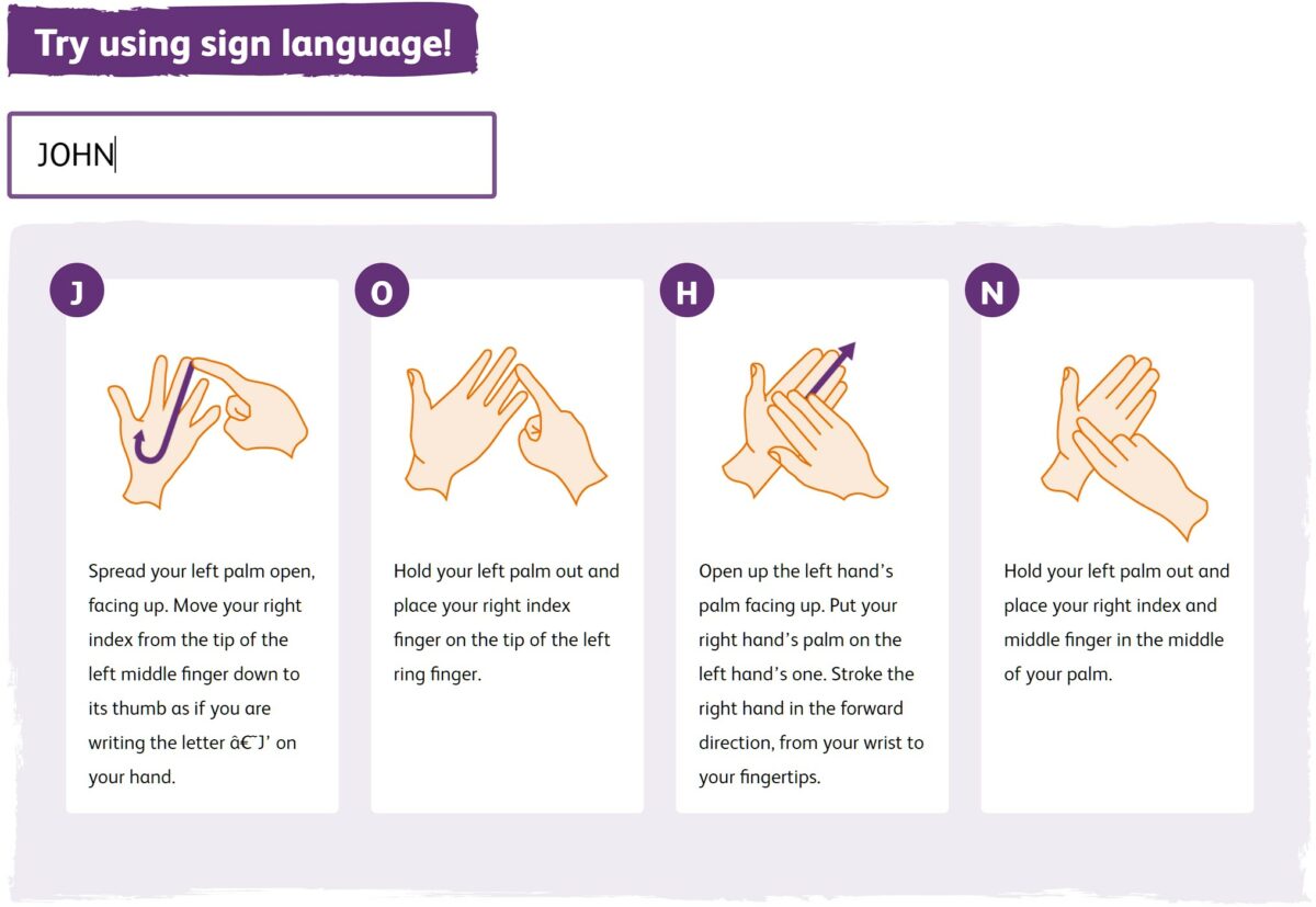
Sign language tool
We also built a tool to allow people to learn how to sign their own names using British Sign Language. Simply enter your name and you are shown instructions with a visual to spell out each letter.
Team
Designer

Tech Lead

Project Manager

Consultant / Founder

Developer