
Author

Membership organisations (like professional bodies and learned societies) need accurate member records.
They need to manage payments, renewals, event bookings, donations, permissions and access, communications preferences, and reporting. They need reliable data, especially when membership income, governance, charitable status, or professional standing are involved. With data protection laws progressing, often it’s easier if members can “self serve” updating their information – often, the website is the place they expect to do that.
The danger comes when the database stops supporting the member experience and starts defining it. Compromises to user experience can be quickly made in favour of ease of implementation, leading to a less-than-satisfactory user experience for members. Without users’ needs in sharp focus, their experiences can take a back seat.

When the system becomes the experience
When internal systems lead, the website becomes a reflection of organisational structure rather than user need. Everything revolves around administrative tasks; join here, log in somewhere else, renew in a different area. Book an event through another platform (or maybe two, depending on whether it’s paid or free). Update details in one place, then get asked for the same information again somewhere else.
Members won’t understand why these divisions exist. They become points of friction – annoyances when using what should be self-service functionality and a de-valuation of membership.
Legacy systems exist for a reason
It is easy to blame legacy membership systems, but that’s not always entirely fair.
Most are introduced to solve real problems. They helped an organisation keep better records, reduce manual administration, and report on subscriptions or income. For some teams, they remain business-critical. They might well pre-date the ability for users to log in and self-serve.
The problem is that, over time, legacy systems can become the deciding factor in member experience.
- Login becomes harder than it needs to be Redirects between systems break or member password updates aren’t synchronised properly
- Onboarding becomes little more than a confirmation email A new member joins, but is not guided towards relevant benefits, events, communities, publications, resources, or next steps
- Member benefits are hard to find or buried in separate content silos They are hidden in difficult navigation, or scattered across different parts of the site
- Renewal flows become more complicated than they need to be Members are asked to log in, find an account area, check details they do not remember entering (and that have changed due to data migrations), choose from unclear membership categories, and complete a payment process that doesn’t reinforce that decision with the value they’re getting
None of these problems are purely technical; they’re service design problems. Just changing the platform doesn’t solve the problem of onboarding if new members still only get a confirmation email and nothing else. All of these issues negatively affect the member’s experience of the organisation and their membership overall.
Membership is a relationship, not a record
A better membership experience starts by treating membership as a relationship, not a record.
That means looking across the full lifecycle: discovery, joining, onboarding, engagement, renewal, lapse, and reactivation. Each stage has different wants, needs, expectations and emotions attached to it (which are easily impacted by a bad experience).

It also means recognising that there is no single “member”. A learned society might need to serve fellows, early-career researchers, students, event delegates, donors, volunteers, committee members, authors, educators, and interested members of the public. Most membership bodies are actually made up of many different audiences with their own distinct needs.
Internal audiences matter too. Community teams, finance, events, marketing, communications, editorial, and leadership all have legitimate needs. These internal stakeholders have needs that, operationally, the system needs to service quickly and efficiently. Most likely, a lot of those are distinct to your organisation.
A UX process does not ignore those needs, or the requirements of legacy systems. It brings them all into the same conversation as the needs of members.
Bring all audience needs into the same picture
The important shift is to stop allowing one or two internal teams, or one dominant system, to define the whole experience.
Taking a step back, research and journey mapping help the organisation see the service from multiple perspectives. What does the prospective member need to know before joining? What information is genuinely required at sign-up, and what can wait? What should happen in the first week after someone joins? Can we make better use of email or other communications channels to drip feed content and next steps? Where do members expect to find benefits? What makes renewal feel worthwhile?
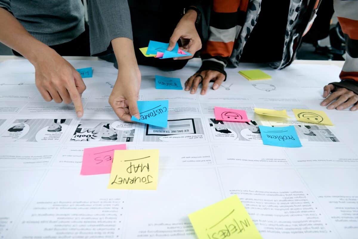
Just as importantly, what data would help marketing improve engagement, rather than simply helping finance reconcile income?
Only once those questions are understood should the organisation decide how the platform, CRM, payment provider, email system, and event tools need to work together.
When a clean break is the best step
The Royal Entomological Society website needed a fresh look to reflect a modern brand, but it also needed to support growing organisational requirements, including membership subscriptions, e-commerce, donations, and paid and free events.
Behind that visible change was a significant operational challenge: existing membership data had to be extracted from an antiquated system built on a defunct database engine, cleaned up, and moved into a new setup so WordPress could act as the future membership hub. It wasn’t enough to use what was there; the existing system was outdated and unsupported, so it made more sense to move everything over to a new platform that supported current and future requirements.
The lesson is not simply “use WordPress instead”. The lesson is that membership platforms need to bridge operational reality and user experience.
Make complexity invisible
Users should not have to experience all that complexity. A good membership website hides the joins. It makes the next step obvious. It asks for information at the right time. It connects events, content, benefits, payments, and communications around the member’s needs. It gives internal teams the reporting they need to make better decisions, not just more spreadsheets.

Most importantly, the process of understanding users reminds the organisation who their members are. A member is not a row in a database. They are a person choosing to belong, contribute, learn, attend, support, and renew. Each step of their journey includes goals, emotions and the possibility to improve their membership experience. The job of a membership website is to respond to those needs.
Contact us for a service design review
Our experience with membership organisations spans learned societies, professional bodies and everything in between. Sometimes it helps to take a step back and look at how membership works from each member’s perspective. We can help with the following aspects of service design:
- Understanding user audiences – external and internal
- User journey mapping
- Solutions design – working out the best way to solve the problems
- UX design and optimisation
- Technical feasibility – understanding what’s possible with your tech stack
- Technical implementation and development
If the above article resonates with you, get in touch to talk about the issues you’re facing, and how we can help.