
Author

The integration of game mechanics into web and other interactive media is not new. Elements such as progress bars, challenges and badges all tap into psychological motivations to make simple digital tasks more engaging and rewarding.

From encouraging us to complete our circles each day on an Apple Watch to earning a Top Commenter badge in your favourite Reddit community, these systems gently motivate us to complete certain actions.
The global video game industry is valued at roughly $300 billion, more than the combined revenues of both the film and music industries. So as UX designers, it made me wonder what else we can learn from games to make our websites more engaging?
Visuals
I don’t want to spend too much time on visuals simply because there’s so much I could cover that it would warrant its own article. But I’ll just look at one aspect…
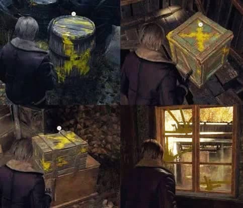
Yellow paint.
For years games have used “yellow paint” to show things that can be interacted with. Gentle guides used consistently become common knowledge. A universal language used in hundreds of games over decades. The web equivalent is probably a simple underline on links, globally recognised and understood but misuse it at your peril, underlining something that is not clickable can break expected behaviours and quickly lose a user’s trust which can be hard to win back.
Loops
Most games operate around the repeated action of a core gameplay loop.
Objective -> Challenge -> Reward
And this applies to most website interactions too. Users have a goal, be it completing a form or finding a certain piece of information, they have an expectation of what’s required and what they want to get out of that exercise. But within each of these there are often smaller loops too, a satisfying animation when a button is clicked or the disappointment of a non-predictive search which could have made life that little bit easier.
Each is an opportunity to either delight or frustrate the user. Frustration comes when the expected loop is not completed.
Complexity
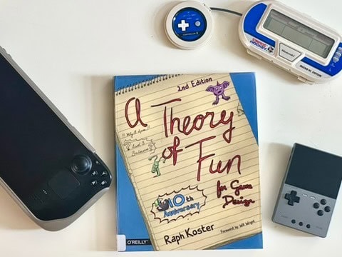
I’ve been reading A Theory of Fun by Raph Koster and it does a wonderful job of breaking down why we find games fun. From recognising patterns to improving skills with practice, what we seem to enjoy most is learning, often without realising we’re doing it.
Human brains are excellent at distilling complex information into chunks of just what is useful but to do this they only see what they think is relevant and can easily overlook everything else.
Can you count how many times the players in white pass the ball?
https://www.youtube.com/watch?v=vJG698U2Mvo
And we often see this when user testing a website, wondering how someone has overlooked a call to action we thought we’d made more noticeable. The answer tends to be that it wasn’t where they expected it to be or that they weren’t just looking for it.
“People dislike chaos, we often call it busy, noisy or ugly. But once we see a pattern in it we delight in tracing it and seeing it reoccur.”
So what can we learn from this?
As designers, while we always aim to simplify things like the information architecture or an interface system as much as possible, at a certain point some things cannot be simplified further without breaking the system’s own logic and unintentionally making them more difficult to understand. And I don’t think we should shy away from complexity if understanding something complicated can be enjoyable and rewarding for the user.
Summary
If users can find enjoyment in learning new patterns we don’t need to be afraid of complex systems as long as they are well thought out and logically structured. We should be encouraging them to explore while ensuring their actions return an expected response.
I think people are happy to commit time and effort into achieving what they want as long as their efforts are rewarded and they don’t feel they are being unnecessarily hampered along the way.