Author

Organisations often spend a lot of time and money on their brand identity so it’s important that website designers effectively interpret that brand for digital.
But, very often they don’t.
There’s no shortage of commentary on this issue – including this piece I wrote a few years back.
But that’s not what I’m looking to cover here. Instead, I wanted to explore what we can do to understand the character of an organisation and translate it for the web.
What do I mean by ‘character’?
In this case, when we’re talking about an organisation’s character (say a company, or college, or charity) we’re looking for words and/or phrases that describe different aspects of the organisation.
These words are used to describe things like the organisation’s values, mission, history, reputation, skills, experience, and the like.
Sometimes, as web designers, we’ll be given brand guidelines that provide these words. But often we need to carry out exercises to identify them. Or at least expand on them.
Character discovery
We have several exercises aimed at identifying brand related keywords. My favourite, invented by our very own Leigh Howells, is one we call Design your reception area.
As the name suggests, we’re getting stakeholders to make design choices about an imaginary new reception area for their organisation. We ask questions about the space; is it small and cosy, large and airy for example? We ask about the view (if there is one). We ask about what might be on the coffee table, and we even ask about how the organisation’s logo might appear in the space.

The exercise gets people thinking about aesthetics relating to their organisation but without focusing on digital stuff. This is ideal because we want to understand core characteristics. It’s our job to interpret what we learn for digital.
Beware false truths
You might think you’re a cool, relaxed bunch of people and you might therefore tell the likes of us that your website should portray those characteristics. Years ago we had the odd experience where stakeholders would tell us that the new site design should reflect words like playful, clever, inquisitive, and cool even.
We then spent time putting together initial ideas for the client team to soon realise the new design reflected them, not the organisation. This meant going back to the drawing board.
Those experiences mean that certain descriptors will raise alarm bells for me. An example being a law firm that kept telling us they were ‘different’. Law firms, potentially more than most, typically don’t want to do anything other than safe and corporate so we pushed hard on the point. We soon realised that the company’s clients hired the firm because of their different-ness which meant that it was absolutely fine to reflect that in the design.
As a brief aside, the Reception area exercise also helps avoid this issue because you’re asking people to think about the design of something that reflects the organisation as a whole.
Why do we need these words though?
Having a set of key words and phrases reflecting character means we can focus on delivering a design based on those terms. This sounds like a statement of the obvious, but without them we could end up heading back to the bad old days of designing three different homepages at the start of a design process.
There was usually a formula of a ‘safe’ option, the ‘right’ option, and a ‘radical’ option. The fact that we were doing these options meant that we were making design decisions based on our own opinions, likes, and dislikes.
Interpretation
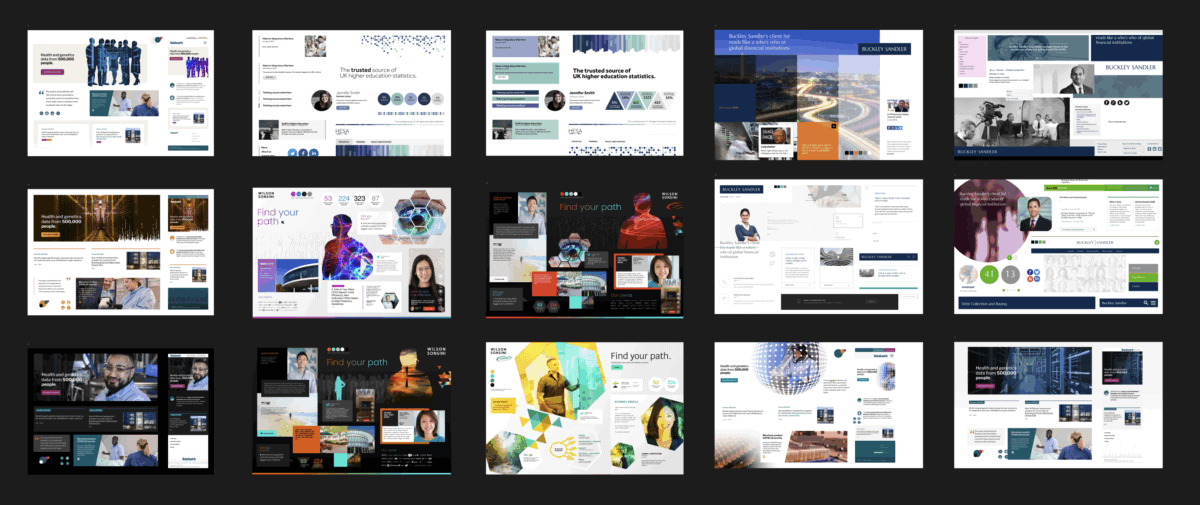
But surely one person’s (graphical) interpretation of, say, the word “dynamic” is going to be different to others? If there’s one thing to take away from this article it’s this.
We realised we needed to bridge the gap between design words and what they actually mean visually. Our solution? A tool that presents paired design directions and asks clients to point us toward their preference.
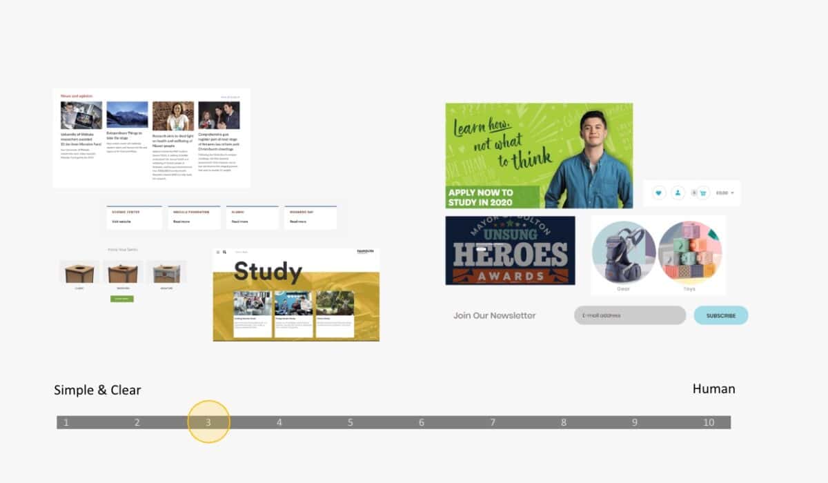
This exercise helps our clients understand what design choices we might make before we begin the process and it gives us a head start knowing which words are more important than others.
Conclusion
Understanding and interpreting an organisation’s character is fundamental to creating digital designs that truly represent a brand.
Discovery exercises, paired with visual interpretation tools, can help to deliver websites that authentically reflect what makes each organisation unique.
The result is a more collaborative, efficient design process – and digital experiences that resonate with both the organisation and its audiences.