We have always placed importance on understanding the character of the organisations we work with to ensure the websites we build deliver exactly the right impression to users.
We think we really got it right on the new Zuckerman site.
About Zuckerman Spaeder
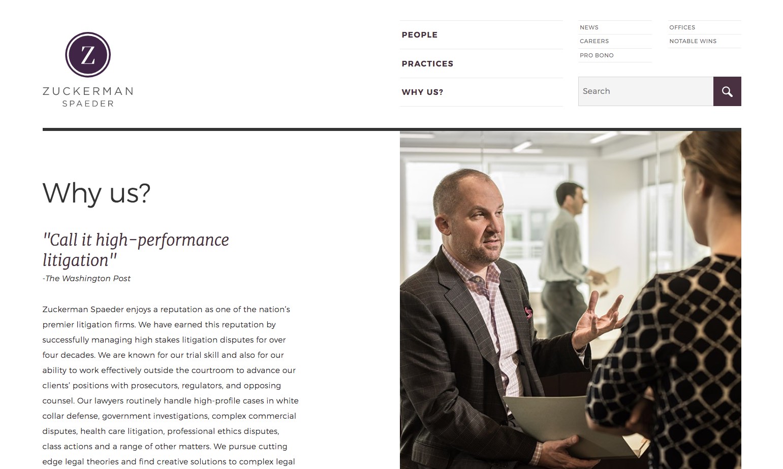
Zuckerman Spaeder enjoys a reputation as one of America’s premier litigation firms. It has earned this reputation by successfully managing high stakes litigation disputes for over four decades.
The value gained from working with Headscape is immeasurable. From beginning to end, their team is a true strategic partner providing the overall guidance and direction to help our firm accurately convey our experience, value, and culture into a website—ensuring that the website is a unique reflection of our firm, rather than one size fits all site.
Diana Courson, Chief Marketing Officer
High profile individuals such as Dominique Strauss-Kahn turn to Zuckerman Spaeder when their liberty is at stake.
We were aware of this reputation before we started working with the people at Zuckerman. We imagined an ultra-aggressive, adversarial company culture would accompany such a reputation, but what we found was quite different.
Stakeholder interviews
We interviewed a number of Zuckerman attorneys. Our aim, as always, was to try and understand the firm’s objectives for its site, who its users are, and the character and personality of the firm.
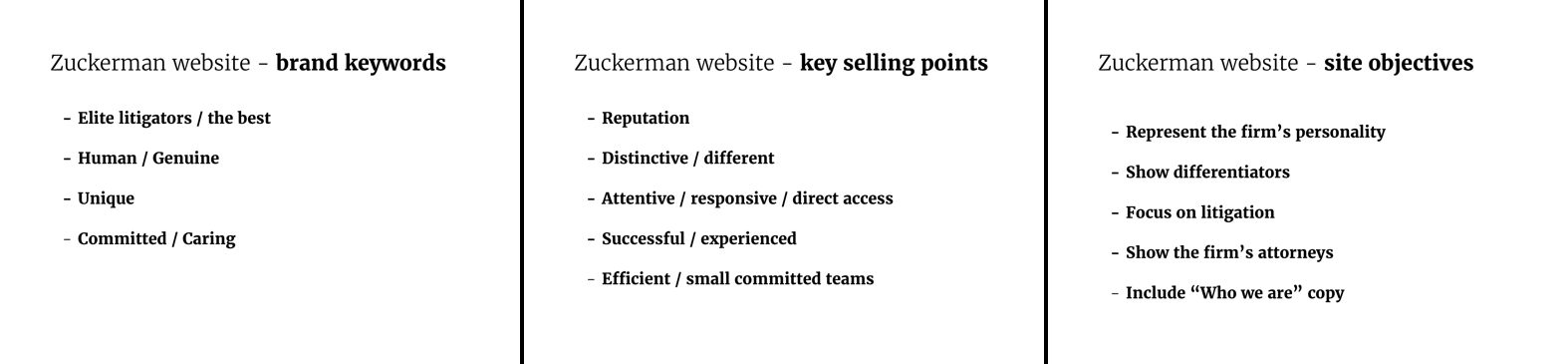
We started to notice trends in what people were telling us. Significantly, they all wanted the site to reflect how different Zuckerman is from other law firms. This meant, taken literally, that we needed to design a site that looked manifestly different to other law firms.
Clients have told us this before. But, usually it’s more of an internal view and not something they want to present to the world. So, we challenged the Zuckerman attorneys and they confirmed that showing their distinctiveness was key.
The firm’s vast experience, track record, in-depth knowledge, and respect throughout the legal sphere, means its lawyers don’t have to pretend to be something they’re not. “We’re just smart, normal people” was a repeating refrain that really helped inform us of the personality that we needed to portray.
Collaboration equals better results
We spent three full days working closely with the Zuckerman team. We carried out a lot of different exercises to really home in on how the new site should look and how it should be structured. This included the following:
Design a reception area exercise where we ask our clients to make design decisions about an imaginary reception space for their company. It focuses participants on general aesthetic elements rather than web/digital items that may distract or mislead the process.
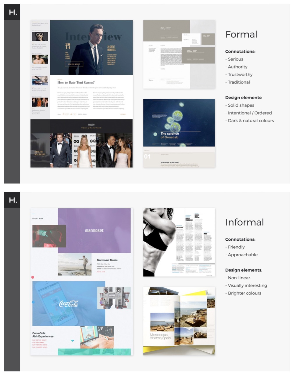
Word pairs exercise where we provide real design examples that correspond with pairs of words e.g. calm/energetic. This means our clients don’t have to make design decisions based on guesses about what a particular word means.
Photography styles similarly to the word pairs exercise, we’re looking to provide real examples of what ‘abstract’ or ‘people’, for example, imagery could be.
Collaborative mood-boarding exercise that provides a simple and quick-to-produce method of demonstrating a potential style through imagery, texture, typography and colour. We agree upon a set of representative words and ask attendees to split into small groups where they create moodboards based on the set of words.
Design a cereal box exercise where we ask participants to place items (selected from a list of content types previously agreed) on a design for a cereal box. This simple exercise forces decisions to be made about content priorities – which content goes on the front, back and sides.
Some key takeaways from these tasks were:
- A clean, minimalist approach was required.
- Images of people – particularly Zuckerman people at work – should be a focus of the design.
- The design needed to highlight the natural/human/caring aspects of the brand as well as professionalism and expertise.
- The site structure should include differentiators (Why Us?) and case studies neither of which are standard content/labels for law firms.
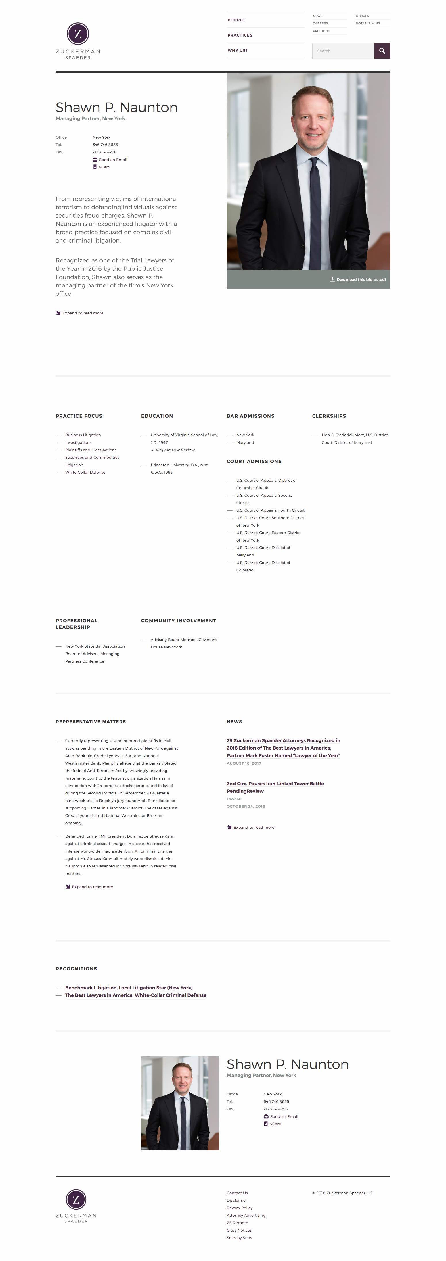
- Lawyer bios (the most popular content on the website by far) needed to display all information on a single page.
- Some aspects of the navigation (People, Practices) were more important than others (News, Careers) so we needed to account for that.
We created moodboards, wireframes and rough mock-ups of possible designs during the workshops. This approach meant that the Zuckerman team was able to visualise and feedback on design work there and then.
We left the workshops with a very clear idea of what the final website should be.
Design and build
Armed with all of these inputs, we returned to the UK to finalise page designs and develop a prototype.
The prototype allowed us to make quick changes to layout and structure following ongoing discussions with the Zuckerman team. The ‘throwaway’ nature of a prototype means that we weren’t afraid to experiment with different layouts and functionality ideas.
The minimal design approach led to a well structured grid and clear typography. The typography, balanced with some generous whitespace, kept the reading experience relaxed and gave us the chance to explore some interesting page layouts within a clear and consistent visual hierarchy. The absence of non-essential decoration might initially seem like a purely design-related decision, but the benefits continued across to the build as well. Markup and stylesheets are lighter, more easily maintainable and ultimately pages load faster.
The site has been built using Drupal 8 which has provided us with a modern development platform. Using the recommended Composer based workflow will allow us to have a smooth maintenance and development cycle for the future.
We set up Drupal 8 early on in the project so that we could migrate old content over to the new site (for example news and blogs) and allow the Zuckerman team to add new content.
The Zuckerman team did a fantastic job on the quality and appropriateness of the copy they produced alongside the excellent ‘reportage’ style photography they organised for the site.