Using data visualisation to track progress of the UK’s lung health
Taskforce for Lung Heath
The Taskforce for Lung Heath is a collaboration of the largest ever group of organisations and individuals who have come together to improve lung health.
Led by the British Lung Foundation (BLF), the Taskforce published a five year plan in 2018 that sets out 43 recommendations for change.
Monitoring and publicising progress against the plan is a vital element of the Taskforce’s work. That’s where we come in.
Working with a health data analysis specialist, and the policy team at BLF, we’ve developed a platform for storing progress monitoring data. We’ve also designed and implemented a range of visualisations, and tools to allow users to interact with data.
The Taskforce data tracker website was launched at a parliamentary reception at the House of Commons in January 2020.
Really well presented and very useful data.
Healthcare professional, University College London Hospitals NHS Foundation Trust
Storing data
While the ‘obvious’ choice for storing data might seem to be a relational database, we were faced with the challenge that data structures needed to be defined iteratively as we experimented with different ways of visualising data.
We needed a platform that everyone working on the project could access, allowed instant access, was super-flexible in allowing data to be manipulated, and had an API allowing data to be extracted programmatically.
Google Sheets meets all of these criteria.
Updatability
An important feature of our solution is that it enables data on the website to be easily updated.
New, or revised, data can be added to the website’s Drupal-based content management system (CMS) simply by specifying a reference to the relevant sheet in Google Sheets. The CMS then retrieves data from the sheet and stores a local copy.
Interactive maps
A key feature of the data tracker is that it enables users to find information about a specific area. We’ve done this using interactive maps.
Of course, data isn’t always collected in the same way or using the same geographical regions. We’ve built interactive maps showing 317 local authority areas for smoking and particulate air pollution data; 14 NHS regions for flu vaccination data; and 62 towns and cities for NO2 air pollution data.
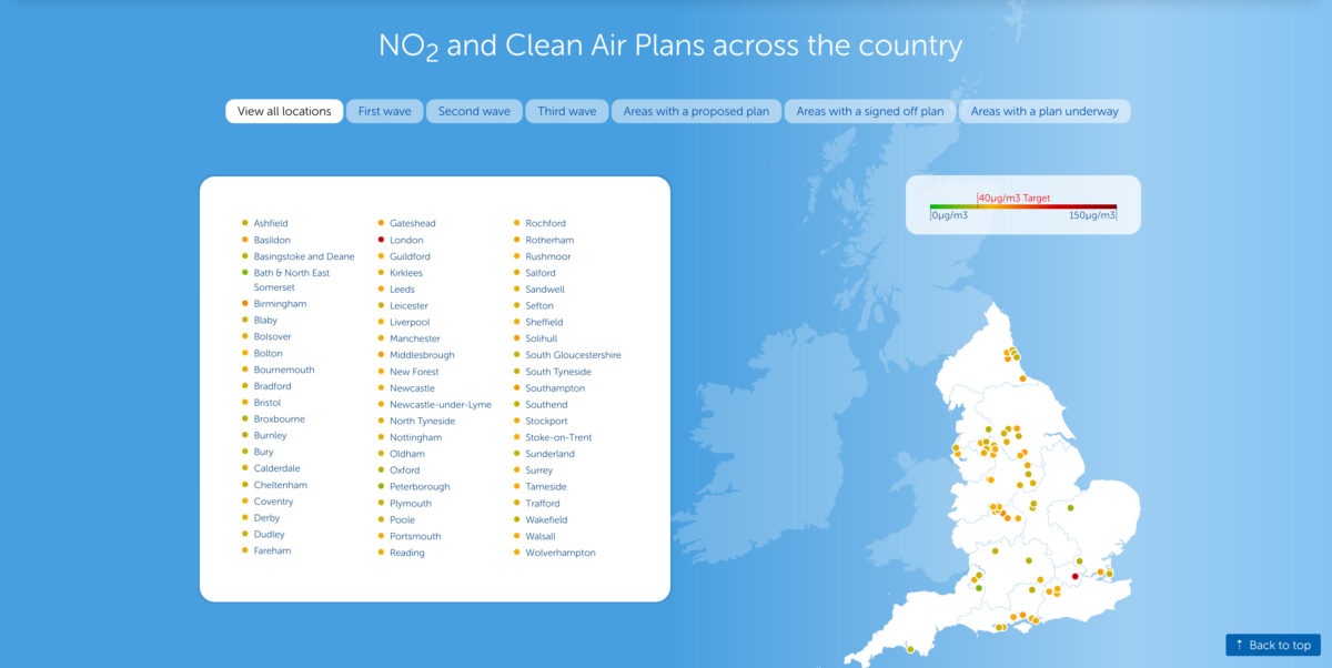
As soon as you start building maps you discover the challenges of sourcing boundary polygons, labelling boundary polygons, boundaries changing over time, new regions appearing, and others disappearing.
Wow this looks fab fab fab.
British Lung Foundation patient representative
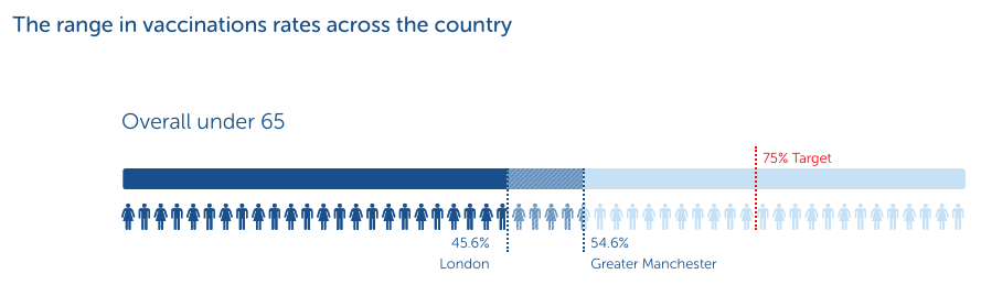
Bars, bars and more bars
Horizontal bars are a useful approach for all kinds of data. However, different types of data needed subtly different presentations – some with block colours, some with colour gradients, some with icons representing people, some with multiple marked and labelled values.
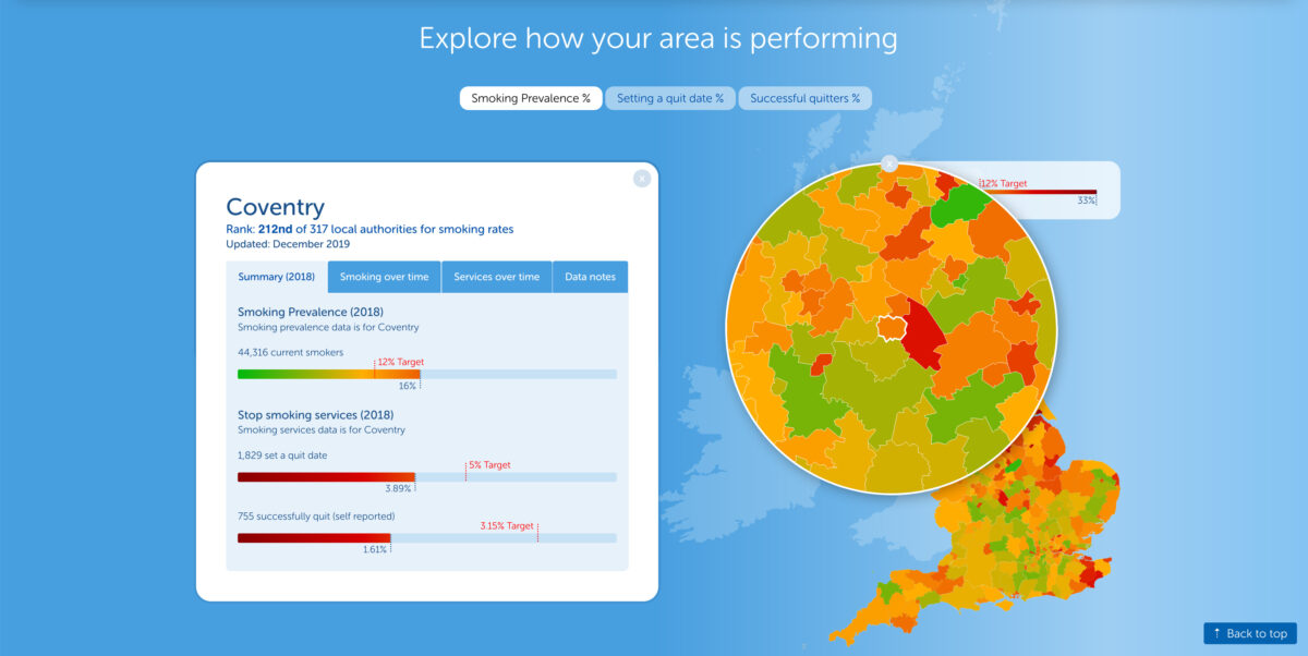
We’ve developed a standardised data model for bars that’s flexible enough to support a wide range of different visualisation styles.
Charts, charts and more charts
We’ve used a mix of approaches to charts, with some being bespoke SVGs drawn dynamically using data from a connected dataset. For others we’ve used the Google Charts API.
Google is particularly good when you want a trendline. Trendlines are available via the Charts API for many chart types, so there’s no need for custom coding.
Well done everyone and thank you. Fantastic resource.
Healthcare professional, Royal United Hospitals Bath NHS Foundation Trust
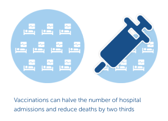
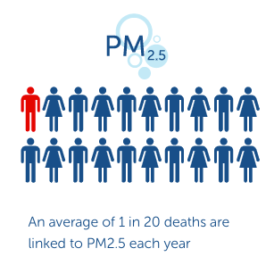
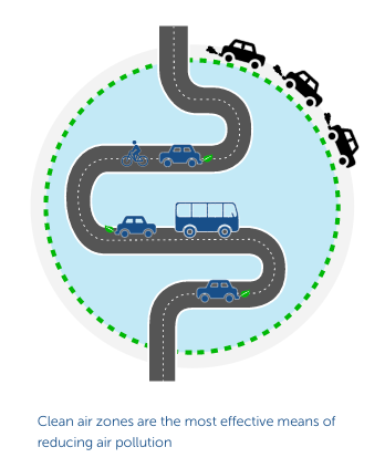
Illustrative graphics
Many points are reinforced with custom illustrative graphics. We’ve established a design language for a standardised approach to graphics.
We love a challenge
We really do love a challenge, and this project gave us plenty to get our teeth into. We’ve had to come up with innovative solutions in many areas.
- CMS tools to integrate data from Google Sheets
- A range of complex interactive map visualisations
- CMS tools for embedding visualisations and laying out pages
- Many different chart types – some bespoke and some using the Google Charts API
- Custom illustrative graphics and a design language for illustrations
- Making it all work on mobile and desktop devices
- Optimising performance for large datasets
We look forward to extending the data tracker as more data is acquired.