Readability apps like Hemingway have bugged me for a while and I haven’t been able to put my finger on why. So, I thought I’d lay out my ideas here to see if I can get to the bottom of it.
I’m not singling out Hemingway for a particular tongue lashing: there are other similar apps, but I know Hemingway so I’m focusing on it. I expect you can apply what I say about Hemingway to any similar app.
Also, to be clear, I’m not picking on people with poor reading ability and I am saying that the copy we read on the internet should be clear. If every blog post read like a James Joyce novel then I suggest we wouldn’t learn much.
But, I do think readability related apps can encourage characterless copy to ensure certain automated readability goals are met. Also, in some cases, I think they reduce meaning.
I believe you can write copy that’s just as clear as something that passes a readability apps’ requirements without resorting to its methods.
Short. Sentences.
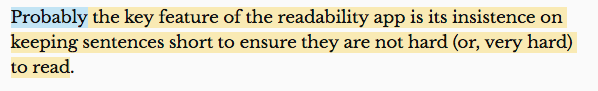
Probably the key feature of the readability app is its insistence on keeping sentences short to ensure they are not hard (or, very hard) to read. Asides or tangents, just like the one I made in the last sentence, are not tolerated. But was it hard to read? Really?
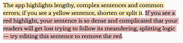
Hemingwayapp.com introduces itself thus:
Well, my previous sentence gets the yellow treatment (I’ll come on to the blue adverb a bit further on):
A “complex sentence”. I repeat: really?
Let’s see what I have to do to get rid of the yellow. Let’s try shortening it first:
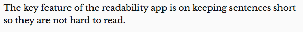
Yay, I win the ‘lose the yellow’ battle. But, I think using the word ‘insistence’ in the previous version helped with my underlying premise that it’s the automated-ness of these apps that is the problem. We’re dealing with the english language here – vast and complicated and gorgeous – we shouldn’t be letting robots guide us on its use!
So, I think, losing that particular word may make the sentence easier to read but it loses some of its meaning. That can’t be good.
Ok, what about splitting it:
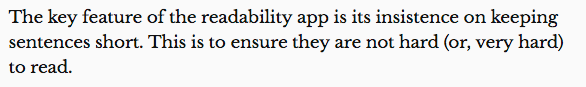
Again, I’ve lost the yellow (win!) but I think this is now harder to read because the “they” referred to in the second sentence is fine in a single sentence but could cause confusion if split into a second sentence – “what’s he referring to?”.
What we need to avoid are awkward, rambling sentences; sentences that feel unbalanced, if you like. For example, a sentence I wrote earlier started life as:
“Asides or tangents are not tolerated, just like the one I made in the last sentence.”
It felt unbalanced and clumsy so I flipped it to read as follows:
“Asides or tangents, just like the one I made in the last sentence, are not tolerated.”
I could split that into two sentences: “I made an aside in the last sentence. The app doesn’t tolerate asides or tangents.” But, I think the single sentence is easier to follow.
Clarity is key, not splitting all your copy into short sentences.
I genuinely don’t think there’s anything wrong with tangents and splitting logic as long as you’re taking the reader along with you. Clarity is key, not splitting all your copy into short sentences.
Adverbs
Ok, I didn’t need that “probably” earlier. It’s possible you don’t need any adverbs in your copy. But, removing them is also likely to lose the conversational aspect of someone’s writing and therefore, potentially, its character.
Sure, lose adverbs that make a statement ambiguous, but if keeping an adverb to make what you’re saying ‘chatty’ – when you want it to be chatty – is fine by me.
Also, sometimes the app just gets it wrong.
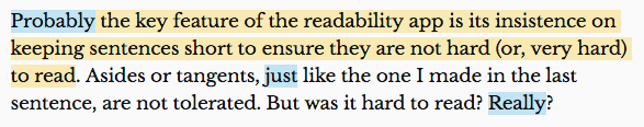
The ‘probably’ and ‘just’ are correct. They’re adverbs that could easily be removed, but the ‘Really’ isn’t. The app simply has the word ‘really’ listed as an adverb (as in “I really don’t like that” when “I don’t like that” would do just as well) so it highlights it wherever it appears and advises you to remove it. But that’s not what it means in this case.
Passive voice
Passive voice, similarly to adverbs, can add character. A word or phrase might have a ‘stronger’ alternative, but if it reflects your style or personality then I suggest it’s more genuine.

Highlighting the green text in this case just isn’t helpful. There’s nothing wrong with this copy and the app is encouraging me to change it, thereby wasting my time.
Summing up
I worry that these tools rip out the character of the writer. Some might say “so what”, especially in a piece that is simply providing, say, instructions. I can’t argue with that. Also, if readability apps help people who can’t write put together something that is clear and legibile then great.
But, for people who can write clearly, I believe they should rely on their own judgement – which, in turn, should display their own personal writing style, rather than potentially homogenising it (goodness, I’m in ‘red’ territory here!) – to create their copy.
Sure, write in short, punchy sentences. Break things up. But don’t fret about throwing in the odd very long, adverb strewn sentence either. As long as it makes sense, that’s the key.