We’ve been working with lots of data recently in several projects and it’s been a lot of fun. Trying to figure out how best to present the data has made us think about user interfaces and user engagement in ways that we hadn’t really had to do much before.
We’ve also had to modify some of our design and production workflows to accommodate the production of visualisations based, in one project in particular, on hundreds of separate datasets.
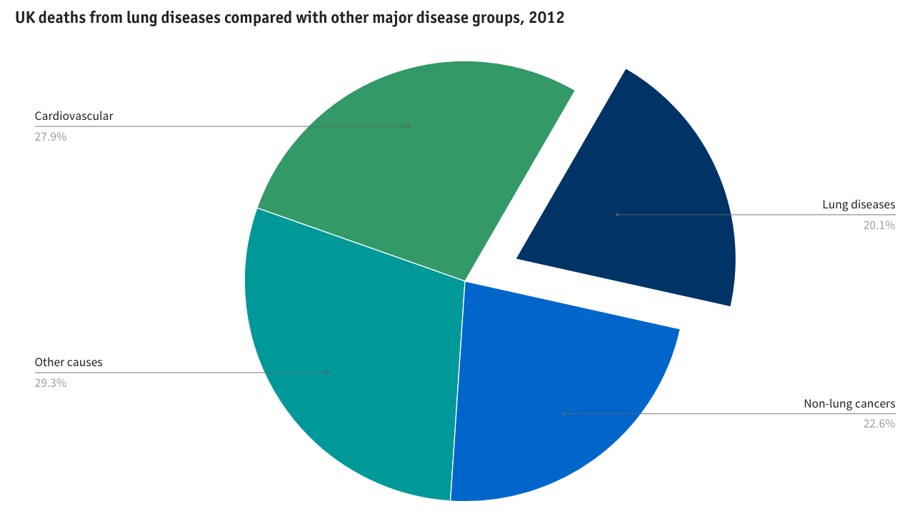
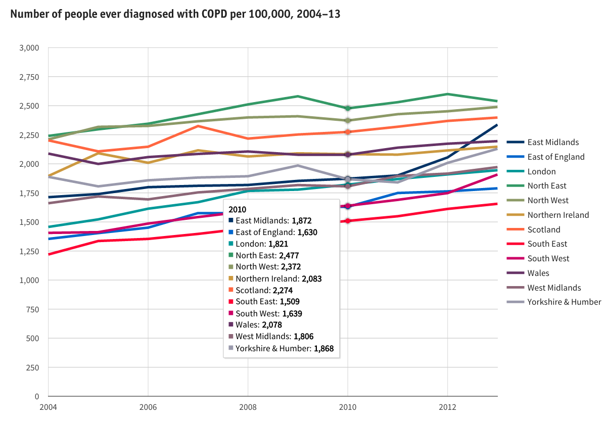
A major study commissioned by the British Lung Foundation (BLF) and undertaken by teams at St George’s University of London, Nottingham University and Imperial College London compiled statistics about lung disease across the UK. We were given the challenge of making this information accessible in an engaging a way as possible online. The published website http://statistics.blf.org.uk is probably the most comprehensive picture of lung disease in the UK ever produced.
Design and prototyping
Our starting point was a large pile of Excel spreadsheets. Excel charts proved to be a good, quick prototyping environment for our initial ideas. How Americans Die was an inspirational site that we kept coming back to – although we didn’t have the time or budget to produce anything as sophisticated as that. The lovely D3.js JavaScript library examples were a good source of ideas.
While D3 is ultra-flexible, it is not so good for rapid prototyping. Google Charts’ superb library has the advantage of a visual user interface that enables easy prototyping. While its visual user interface is limited in functionality compared to the Google Charts API, it enabled us to build concepts fast, review them with our client and modify as we reviewed.
Our design process didn’t just address the static presentation of data. We wanted users to be able to interact with the data visualisations to find out more. Hover annotations, supported by the Google Charts API, provided a flexible way to do this.
Coding
Once we’d decided on the chart types we wanted to use Ian and Dan, two of our developers, coded them using the Google Charts API. JSFiddle proved to be a really useful tool for sharing and editing code as we fine tuned the styling parameters.
To minimise complexity, we coded each dataset using JSON and persisted it in a database with a single database record per dataset.
Workflows
So, with more than 150 charts to create, how did we go from spreadsheet to beautiful charts?
First, we had to develop a set of JSON templates for each chart type. Then, we had to pre-process data in the supplied Excel spreadsheets into the right order before exporting as CSV files. The next step was to convert this CSV to JSON using one of the many online tools such as Convert CSV to JSON. This JSON data could then be pasted into the relevant JSON chart template. Many of the charts then required some final “tweaking” – for example to pull out a specific slice in a pie chart – to achieve the desired result.
Are there opportunities for automation in this workflow? Certainly, there are. As implemented on this project a lot of manual copying and pasting was needed. Next time we will implement some simple tools to reduce the manual work required.
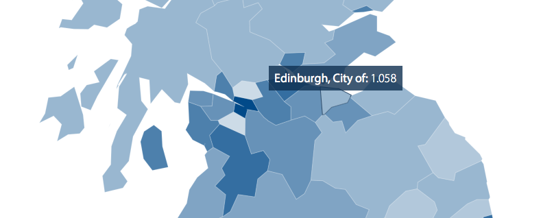
Maps
Maps turned out to require a different approach and workflow. We needed to display some of BLF’s data using maps covering England, Scotland and Wales broken down into over 250 regions. Google Charts’ support for mapping is limited, so we used the power and flexibility of D3.js.
With supplied boundary and region data files larger than 50 MB, one of our biggest challenges was to reduce the map to a size that could be served on the web and withstand some map zooming while having a sufficient resolution to ensure that regions retained recognisable shapes and the smallest regions, for example in central London, didn’t disappear. Using a combination of the QGIS open source GIS and mapshaper tool for topologically aware shape simplification we were able to reduce the underlying map to 102 KB while maintaining interlocking polygons covering the entirety of England, Scotland and Wales.
Not just lovely data – compelling and powerful too
Think about the data you’ve got. By displaying it online could you be telling your story or making your case in a more compelling way to your target audiences?