The new design for the Hampshire Fire and Rescue Service website provides clear, prioritised content for its users. We’re really pleased with the result.
Form
When we first started working with Hampshire Fire and Rescue Service we were probably a little guilty of thinking that its new site should be a paragon of minimalist, functional design. There wouldn’t be a great deal of character to portray, would there?
This turned out to be far from the truth. The Service’s brand – which certainly wasn’t being represented in the old site – focuses on the people who make up the Service and how it helps local people.
At the project kick-off we asked the project team to design a waiting room that would ideally represent the service. This is a great exercise that gets people thinking about the character of an institution but removes digital stuff like buttons, navigation bars, headers and footers.
We asked questions like ‘What size/format should the waiting room be?’ which led to responses such as ‘no walls’ and ‘open and airy’. ‘What sound should people hear?’ prompted the response ‘the sound of people at work’. We translated these (and many other) responses into a design approach that is minimal and content-focussed yet retains a sense of personality and uses imagery of people working rather than military style ‘parade’ images.
Function
We spent some time working with the team on objectives and audiences and the prioritisation of both. These prioritised lists gave us the tools to start developing content ideas and associated layouts.
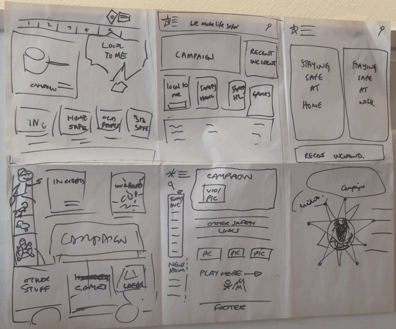
We involved the Hampshire Fire and Rescue Service team through a couple of exercises. Firstly we looked at designing a mobile homepage for the new site. The team split into groups of two, developed some ideas using pencil and paper then presented their thoughts back to the wider group. This exercise really concentrates the mind on which content types should take priority.
We also did an exercise called ‘6-up’ where we asked team members to quickly draw different homepage designs. The purpose of the exercise is to encourage creative thinking. Participants will stick to “safe ground” for their first two or three designs but will explore more radical approaches thereafter. It can also be good fun!
Design and build
We took all that we learned in the workshop and developed some design mock-ups and wireframes that eventually led to a set of templates representing the new site design. These templates were integrated in the EasySite CMS by the EasySite team.